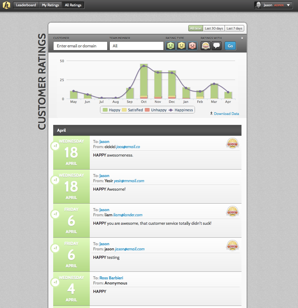
Can I see performance trends for my users?
Yes. To view graphs and trends of team performance click on the ‘All Ratings’ page. This page will display trending data in the form of a bar graph for your users. You can also see all of your customer ratings aggregated on this page. You can filter the ratings by Happy, Satisfied and Unhappy and indicate if you only want to view ratings with WOWs and/or comments.
In addition, you can filter the page by the following:
- Last 7 Days (View data from the last 7 days by day)
- Last 30 Days (View data from the last 30 days by day)*
- All Time (View data for all time by month)*
The bar graphs display the total number and percent of each rating type received. Hovering over the different colored bar sections will display the number of ratings of this type. The graph section also includes a purple trend line. In addition to being able to quickly seeing a trend, you can also hover over the dot and see the overall customer happiness % for this period.
You can also choose to view data for specific users. Simply select the user name from the dropdown. The page will display data for this user only.

Leave a Reply!