Can I see customer happiness and rating trends for my customers?
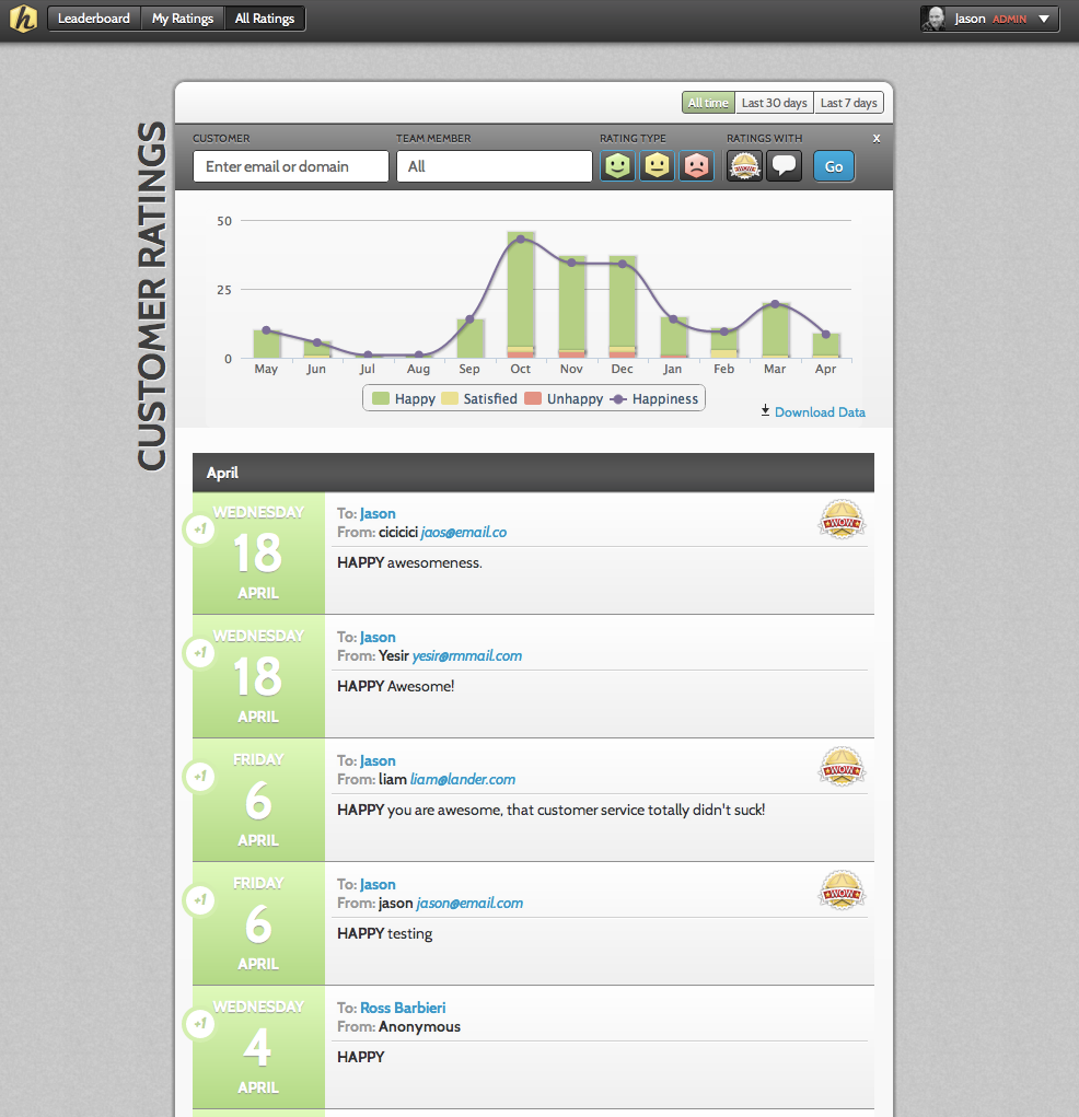
Yes. To view graphs and trends of customer happiness click on the ‘All Ratings’ page. This page will display trending data in the form of a bar graph for your customers. You can also see all of your customer ratings aggregated on this page. You can filter the ratings by Happy, Satisfied and Unhappy and indicate if you only want to view ratings with ‘WOWs’ and/or comments.
In addition, you can filter the page by the following:
- Last 7 Days (View data from the last 7 days by day)
- Last 30 Days (View data from the last 30 days by day)*
- All Time (View data for all time by month)*
The bar graphs display the total number and percent of each rating type received. Hovering over the different colored bar sections will display the number of ratings of this type. The graph section also includes a purple trend line. In addition to being able to quickly seeing a trend, you can also hover over the dot and see the overall customer happiness % for this period.
You can also choose to view data for specific customers. In the form field up top, simply enter a specific customer email (example: jason@companyemail.com) or an email domain (Example: @companyemail.com) to view all of the ratings received from customers with that domain.

Is there a way to also make a “master” snippet for the entire team? I love the idea of having the QR code on feedback postcards but I think we’d have to limit it to one code for postcards, individual ones for team members’ email signatures. (also we could probably use a general one just for “general” website feedback as well!)
I know Hively is optimized for interaction feedback, but it seems that for many “non-tech support” based feedback this could be used for a lot of general “Contact Us!” feedback as well. What do you guys think?
Yes, you can set the Default Rating Snippet for your team and you can choose the QR Code snippet as this option.
http://support.teamhively.com/question/what-is-the-rating-snippet-gallery/
Reply